41 Chest Quote Tattoo Designs for Men
Chest quote tattoos are a mainstay for the men who wear them. This type of tattoo becomes a part of who they are more than a tattoo on any other body part.
It’s much like communicating to the outside world, “This is who I am, this is what I believe.”
In most cases, the designs are not refined or extremely decorative. The focus is on the words inked eternally on the chest area and their meaning. Whether the words arise from a book, movie, famous speech, or poem, a chest writing tattoo design is usually symbolic to the wearer.
Sometimes the quote blatantly depicts the psyche of the man, and at other times, it may appear cryptic and paradoxical except to the person sporting it. Even so, behind every chest quote tattoo idea, there is a deeply personal narrative. Even if the tattoo appears simple and easy to understand, it may hold a very different meaning to the wearer. What’s more, the motivation for getting a chest quote tattoo plays a huge part in the tattoo wearer’s decision.
An engagement, birth of a child, or death of a loved one or a much-loved pet can all be motivations for getting a quote tattoo on the chest area. This type of tattoo has curative properties that assist a man with healing the past, accepting today, and looking forward to the future.
Here are some amazing tattoo examples you can ask your tattoo artist to ink on your chest.
See more about - 109+ Best Chest Tattoo Ideas
Chest Quote Tattoo Ideas
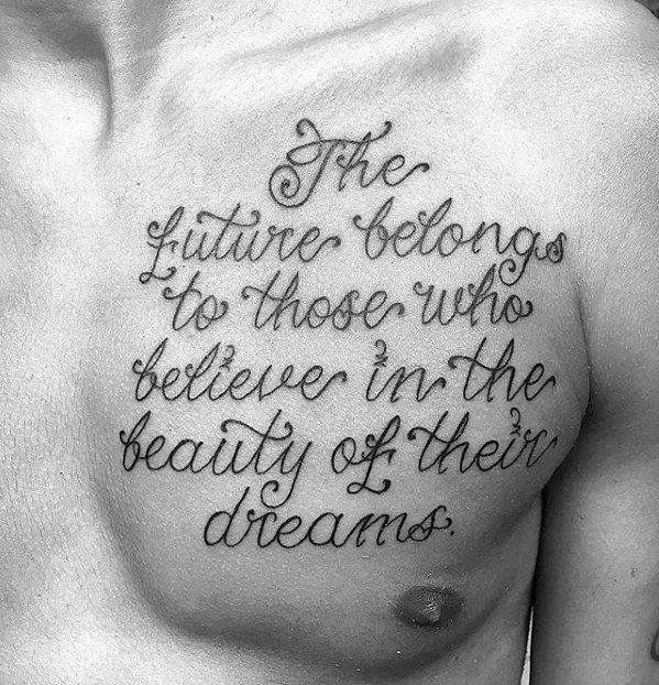
“Born again still your son,” is an excellent quote referencing god and a parent. The cursive for this is nicely flowing and well decorated, although it took a while to decipher. The curving and placement are fine, but it and other future could benefit from being another inch closer to the curving collarbone. Should the subject want more work done in this area, then the quote will need to be incorporated into a of rather than being used as a natural border.

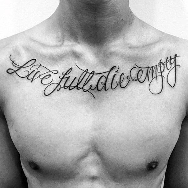
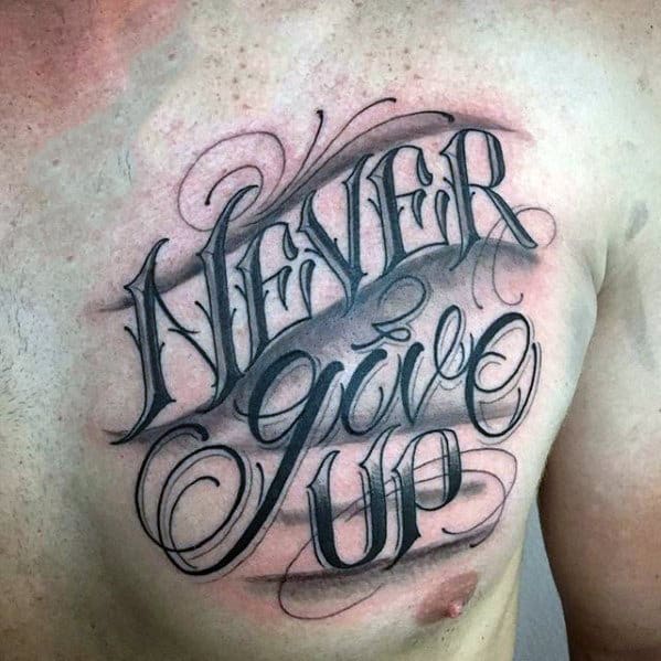
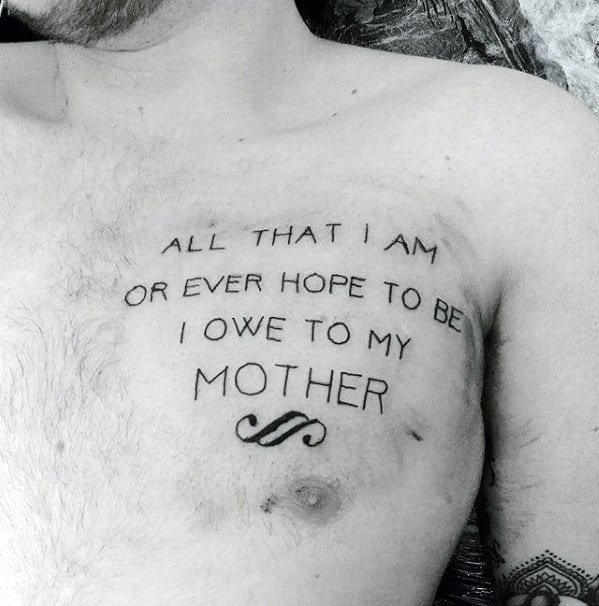
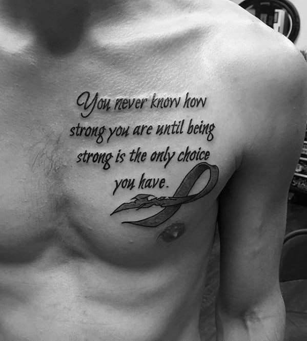
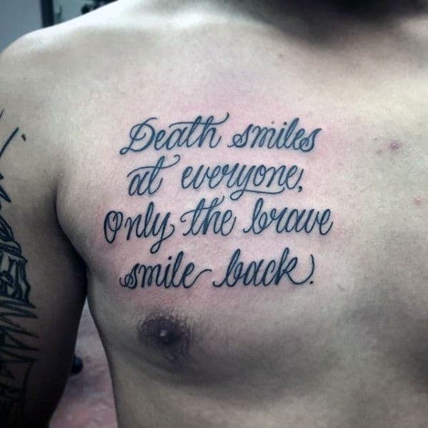
This is a clean, effective . The lack of spectacular imagery or works perfectly in getting this simple message down and stylized. The slightly ratty ribbon is a deft testament to the hard work needed to grow strength of character.
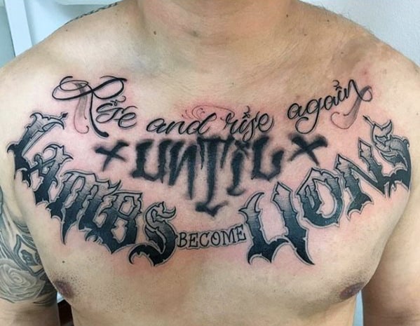
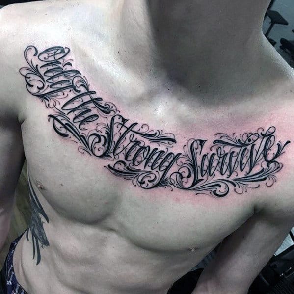
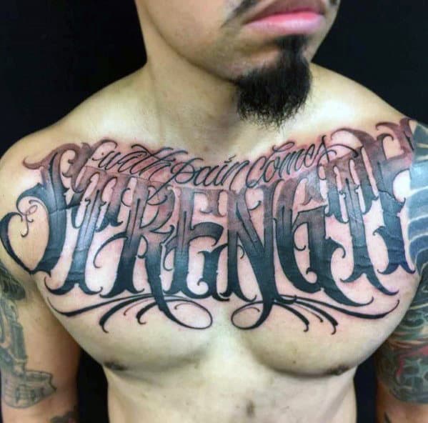
This large, bold cursive is a hallmark of the Chicano graffiti style, which is popular among because of the free-flowing yet still weighty characters able to be created. In this , the is strengthened by inking in sharp, heavy black internal detail. This allows the piece to be large and looping but it remains easy to decipher among the swirls and squiggles.
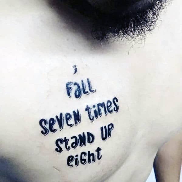
This is a fascinating . Research the semicolon symbol and its significance in – especially if you’ve struggled with mental health – for a full primer on a great subculture. It’s interesting and important for and others. Building on the small symbol, this applies a very funky and innovative to display its message. The stark black single needle fill for the words gives it a vivid, sharp application.
Crisp cursive can make the difference between a cleanly produced affirmation and something completely – or worse, almost – indecipherable . If you’re opting to use words on skin, always try to make sure there’s a clarity to the wording even if it’s threaded into part of a larger piece of . Also, thoroughly spell check, theme check, and context check any foreign and dead languages you wish to use so you don’t make a mistake. For example, there are lots of guys walking around with the Chinese symbol for strength in construction and building methods rather than physical manifestations of prowess out there. Be smart!

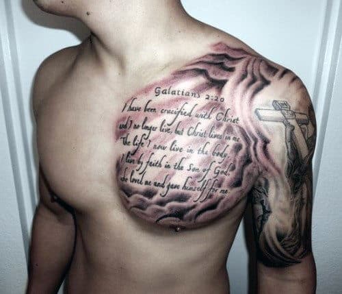
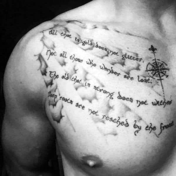
Yes! Always love a bit of J.R.R Tolkien, and this Lord of the Rings is nicely done. The choice brings that Hobbiton feeling of sharp quills, fat fingers, and hairy feet to the fore, yet remains easy to read and cool to look at. I also like the sun blaze shading pattern that alternates with neg space. It may prove to be too light over time but it fills space cleverly (the is quite wide by standards) without being a focal point of the .
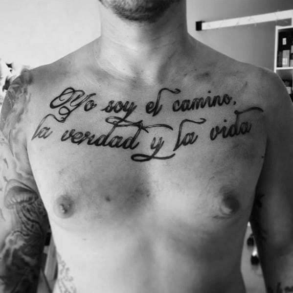
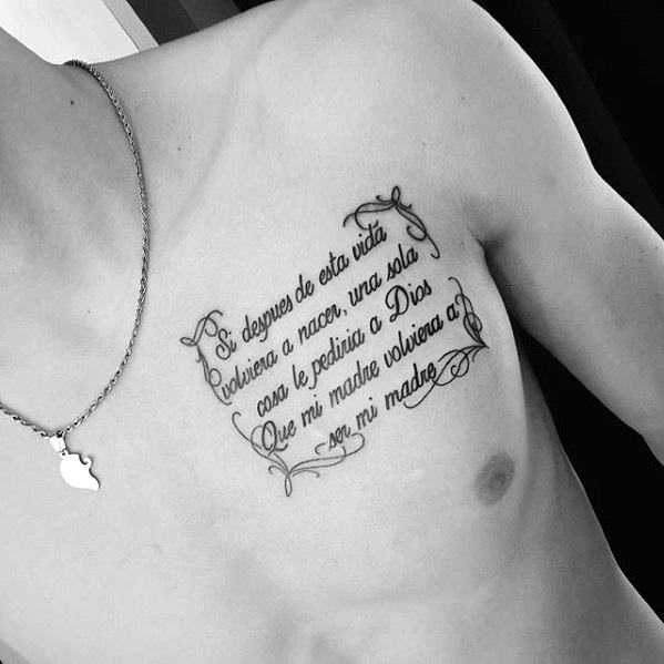
Spanish is great for tattoos, including . It often flows just as beautifully on page or skin as it does in conversation. The in this example is nicely delivered. There are no spectacular bells and whistles, just a simple message in fresh cursive augmented by a few bits of fine needle bordering fancy.
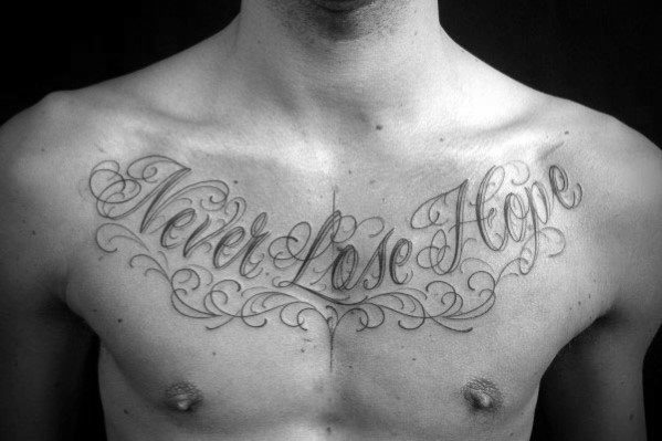
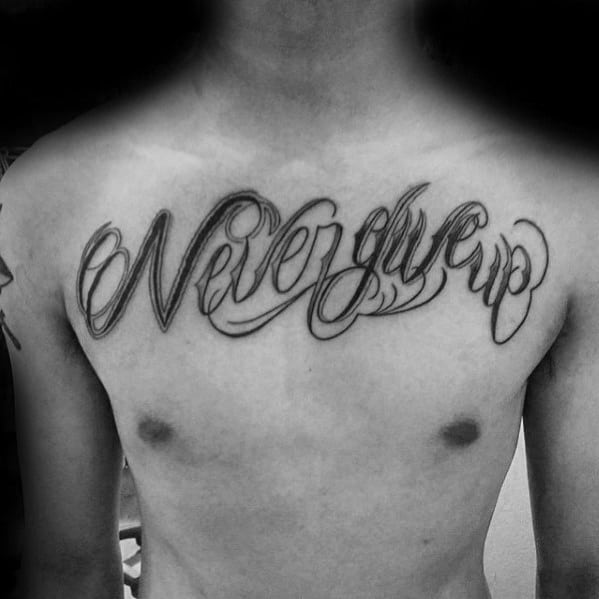
Here’s another effective, of . The is large, unique, and well balanced on the subject’s left breast. Only a slight, pedantic quibble — the “e” when ending a word kind of looks like it’s added an “r” at the end because of the flourish. It’s a small nitpick, but the type of thing you notice when words spend 20+ years being read from the same page.
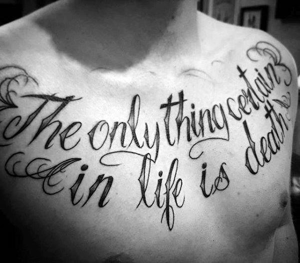
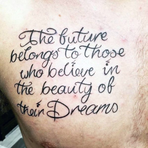
I like the cursive in this . It’s easy to read but still flourishes nicely, and the handwritten note effect of the size works well in the placement.
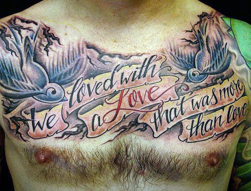
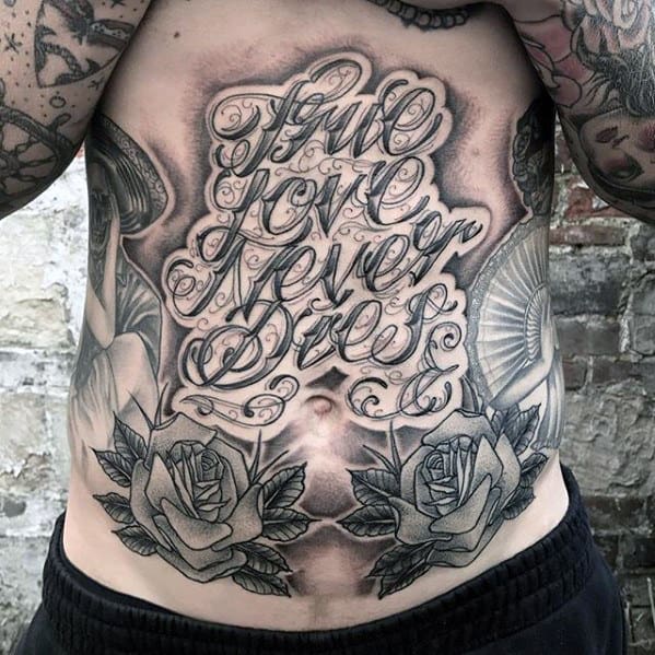
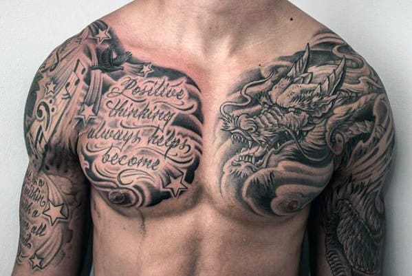
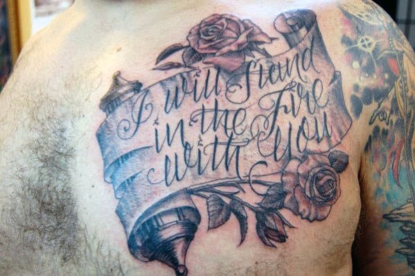
This has been effectively incorporated into a much larger piece of work. The quote itself is clean, crisp cursive that utilizes a nice touch of white ink highlight across each word’s middle. It’s cleverly filled with fuzzy flowing shadow and sharp stars to align it with the rest of the subject’s right side .
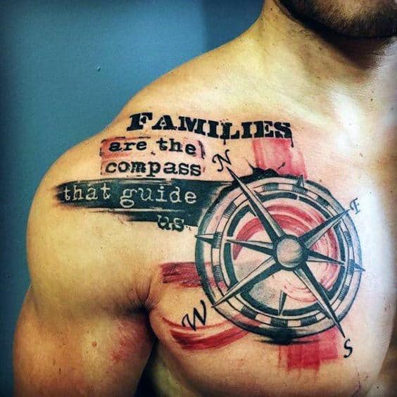
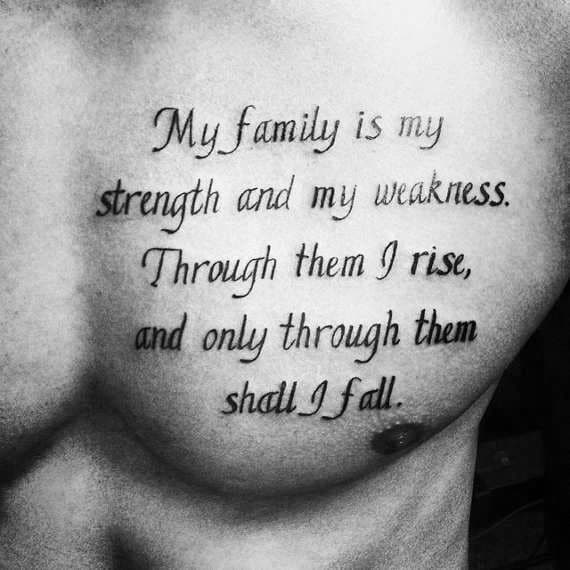
This is a cool family-oriented quote. There are contradicting word thicknesses (like when kids press too hard on their pen) through the left edge of the piece, but hopefully, they will settle down and not look so different as time passes.
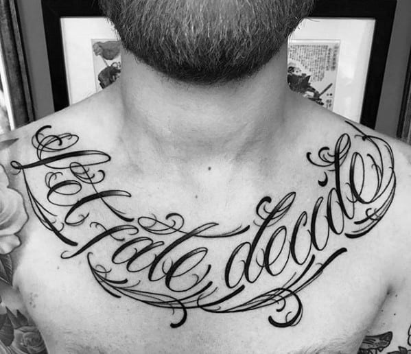
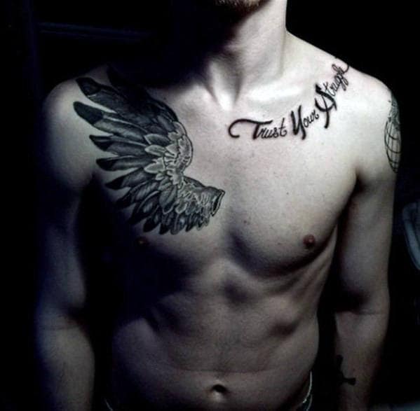
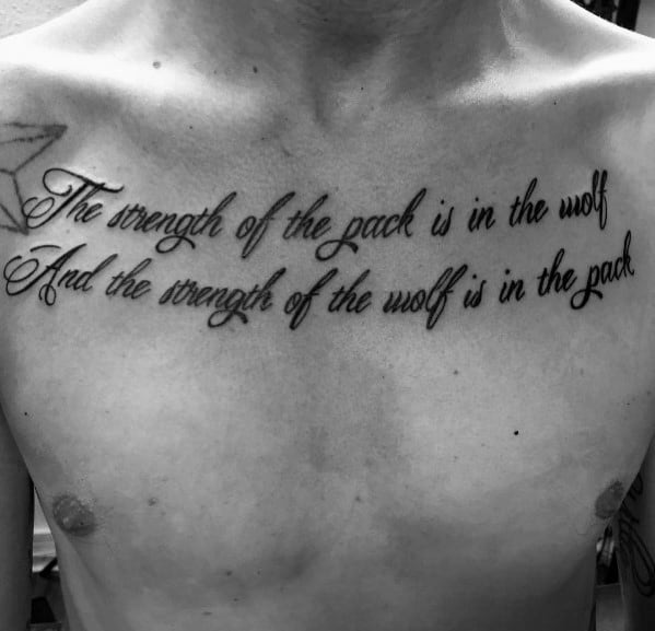
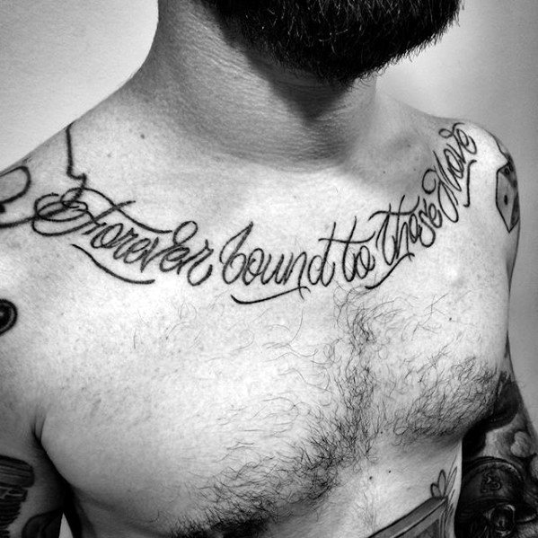
This is well placed, curving along the subject’s in a nice flow. The cursive is helped by the large text but it would have been clearer with thicker lines and white ink highlights. The underlined borders could also be thickened and extended to provide more shape.
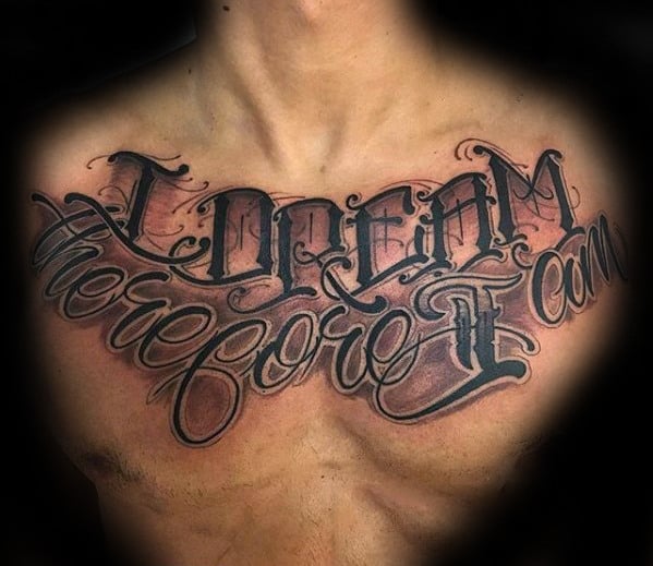
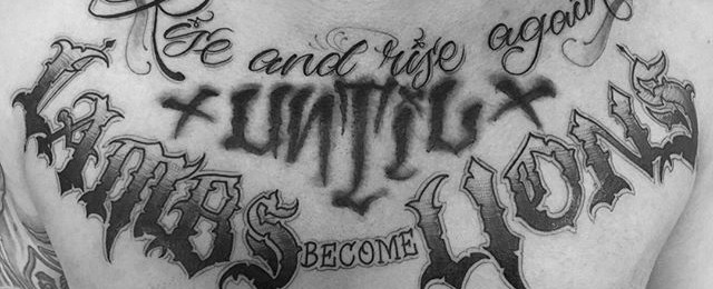
A pick-n-mix . Individually the different types of are interesting, but together and lacking fill pattern, the fonts clash against each other and are jockeying within the space. The internal shading is excellent – the piece needs a bright block color fill to bring the in line by contrast or more attenuated gray shading work to add balance.