Luxury Restaurant Interior Design Ideas That Shape the Dining Experience
You walk through the door and something just clicks. The mood is right. The light is warm. You find your seat, and before you’ve touched the menu, you already know you’re going to enjoy this place.
None of that happens by chance. It’s the result of a lot of deliberate design decisions working together quietly in the background — the kind you don’t consciously register when they’re done right, but absolutely feel when they’re done wrong.
So what actually makes one dining room forgettable and another one the kind of place people talk about? Here’s what separates them.
The Room Sets Expectations Before Service Begins
Your guests have already formed an opinion by the time they reach the table. They clocked the entry, read the materials on the walls, and decided whether the lighting makes them look good or feel like they’re sitting under fluorescent bulbs at a DMV. That all happened in the first twenty seconds.
Real luxury doesn’t rely on expensive items to announce itself. A marble countertop and a $400 chair don’t automatically create a premium atmosphere if nothing ties them together. What actually reads as high-end is intention — choices that feel like they were made by someone with a point of view and followed all the way through. Four materials working in harmony will beat ten expensive ones fighting each other every time.
And it’s not just visual. Sound, temperature, scent, the feel of what your hand lands on first — your guests absorb all of this before anyone says a word to them. The best restaurant interiors start communicating the moment someone steps off the street. That first impression is your design working, or it’s your design failing you.
The Elements That Do the Most Work
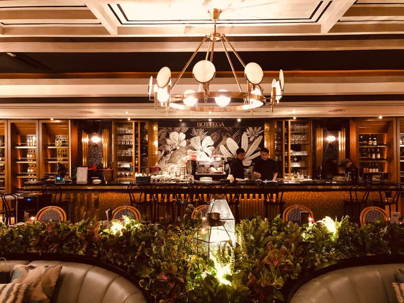
Lighting Is the Most Underestimated Tool in the Room
Most designers will give you the same answer when you ask what separates a great dining room from a merely decent one: the lighting. Not the fixtures — the actual quality and behavior of the light in the room.
Warm, low-level ambient light flatters faces and makes conversation feel intimate. Directed task lighting over tables creates a sense of focus and occasion. Pendant fixtures are workhorses here — they pull your eye upward, break up the ceiling plane, and add visual texture right at the level where people actually look. Play with contrast too: pools of brighter light against darker corners give a room dimension and life that flat, even ceiling lighting simply can’t produce.
What to avoid: anything that makes skin look gray, anything that bleaches the food, and rows of recessed downlights that make an expensive dining room feel like a well-decorated office.
Materials Create Atmosphere Long After the Renovation Budget Is Forgotten
Brass ages differently than chrome. Velvet pulls sound out of a room in a way that changes how conversations feel. Marble reads as permanent. Aged wood reads as warm. Pick the right combination and your interior does emotional work automatically — guests feel the difference without being able to name what they’re reacting to.
The smartest luxury interiors don’t try to do everything with materials — they pick three or four and commit. Marble on the bar and bathrooms. Leather or velvet on the seating. Brass in the light fittings and hardware. Wood in the floor or the ceiling. Each surface chosen for how it performs under that specific lighting, and how it holds up over two or three years of real use.
Don’t overlook texture either. A room built entirely from flat, smooth surfaces ends up feeling sterile. Mix a rough stone wall against smooth leather banquettes, or a raw steel frame against soft upholstery, and the space starts to feel crafted rather than assembled.
Seating Is Where Comfort and Status Intersect
People don’t just sit where they’re put. They choose where to sit, and they pay attention to what different seats signal. The corner booth, the bar stool at the pass, the center table in full view of the room — these carry different meanings for different guests, and good seating design gives each position its own character.
Banquettes are one of the best investments in a restaurant fit-out. They make a medium-sized room feel like it has multiple distinct personalities. They create privacy, encourage people to linger, and turn what might be an awkward wall run into the most coveted seats in the house. Booth seating goes further — if your concept supports it, booths give guests the feeling of their own private world inside a larger space.
Seat height relative to table height is one of those details that trips up a lot of otherwise well-designed rooms. Get it wrong and guests spend the whole meal slightly uncomfortable without knowing exactly why. Get it right and they order another round.
Layout: Why the Floor Plan Is as Important as the Finish Schedule
A restaurant can have extraordinary materials and still feel wrong. Often the problem is the floor plan.
Guest Flow and the Circulation Problem
Pack tables too tight and the energy tips from lively into stressful — for guests and for the floor staff trying to get through. Luxury, at its core, is about ease. That requires real space between tables, enough room for service to move without performing acrobatics, and a clear, considered path from the entrance to the dining room.
Don’t underestimate your entry sequence. The thirty seconds it takes a guest to walk from the door to their seat sets the tone for everything that follows. A cramped entry, a noisy host stand, a sightline straight into the kitchen — these are poor starts to an evening that should feel seamless. A deliberate transition zone, even a small one, builds anticipation instead of friction.
Zoning: Letting Different Parts of the Room Feel Different
The best restaurant dining rooms have distinct areas within them — not by accident, but by design. Perimeter banquettes for guests who want some privacy. Tables near the bar for the crowd who came for the energy. A quieter section toward the back for longer, more intimate meals.
Getting this right means the same room serves different guests well simultaneously, without any zone making the others worse. That’s harder to pull off than it sounds, and it starts on the floor plan, not during the fit-out.
Bar Areas and Focal Points That Give the Room a Center of Gravity
Every great restaurant has a moment — the element that stops you when you walk in and that sticks in your memory afterward. A dramatic marble bar. An open kitchen behind glass. A wine display that runs the full height of a wall. A ceiling installation that does something unexpected with the vertical space above the dining room.
These focal points aren’t just decorative. They anchor the room and give guests a reference point. They become the phrase people use when they recommend the place to a friend — “you know, the one with the big bronze bar” — which is exactly what good hospitality design is supposed to do. Build these moments deliberately, and choose one rather than three. Too many focal points and none of them land.
How Memorable Restaurants Build a Visual Identity
Some restaurants become landmarks. Others, with food just as good, stay local favorites and nothing more. A big part of what separates them is consistency — the sense that every element in the room was chosen by the same set of hands, with the same idea in mind.
Start with your color and material palette and keep it tight. Three or four tones, a single metal finish carried through the hardware and the lighting, a textile choice that runs from the seating to the curtains to the menu covers — this kind of coherence signals that someone was paying attention, even to guests who can’t explain what they’re responding to.
From there, the details do the rest. The way the candles are mounted. The weight of the napkin. The profile of the chair leg. Individually, none of these matter much. Together, they make the case that the place was built with care — and in luxury hospitality, that perception is almost everything.
Planning the Concept Before Breaking Ground
Here’s where a lot of restaurant projects go sideways: operators spend months on the food concept, the name, and the brand identity, then rush through the design decisions because a lease deadline is approaching. Finishes get chosen from samples in an office. Lighting gets value-engineered. The seating layout gets compromised to squeeze in four more covers.
The antidote is testing ideas in context before anything is committed to construction. Before finalizing finishes, lighting schemes, and layout decisions, many hospitality teams use restaurant renderings to see how the concept will actually read in space — how the light falls on that wall treatment, how the bar reads from the entry, whether the material combination that looked right on a mood board holds up when it’s all together in the room at once.
This kind of previewing isn’t a luxury for big-budget projects. It’s a practical tool for avoiding the expensive mistakes that are very difficult to fix once the contractors are done.
The Room Is Part of What You’re Selling
Today, guests choose where to go partly based on how a place looks and feels — and partly on how it photographs, which is the uncomfortable reality of contemporary dining culture. They stay longer in spaces that make them feel at ease and well-placed. They recommend the places that gave them a physical experience worth describing.
Good restaurant design works on two levels at once: it’s emotional and it’s practical. It changes how people behave at the table, how long they stay, and what they remember about the night. Design that pulls in the same direction as your food and service makes the whole experience feel cohesive. Design that fights against it — a great menu in a room that doesn’t fit — leaves guests slightly dissatisfied even when they can’t pinpoint why.
Getting it right means treating the interior as a real design problem from day one, not something to sort out once the menu is finalized. Every material choice, every light fitting, every seat in that room is sending a signal. Make sure it’s the one you actually want guests to receive.